I’d like to show you how we maximized productivity through improving user experience for the Hendrix project
If there is one message I’d like you to take home from this is: Improving the user interface in order to boost productivity is not simply about redesigning an existing interface, replacing layouts, colors, icons & buttons. It’s not even about taking a page-based HTML interface and reprogramming it into a rich interface. It is above all about the ability to understand user behavior and improve underlying processes that will inform the interface design, creating a successful user experience and ultimately boost productivity.
This project helped by:
- Cutting the turn over rate of our T1 Support agents from 73% to 21% saving $14M in training costs and $3.8M in search and hiring costs.
- First call resolution jumped from 23% to 67%
- Average call time dropped from 37mins to 13mins
- CSAT scores rose from 42% to 77%
- Net promoter score from a 3.2 to 7.6
This was also an attempt to "Eat our own dog food" and use only Adobe LiveCycle products to create a solution. We also moved to a new hybrid SDLC D3 - Discover | Design | Deliver. The first known use of this methodology.
I was asked by executive management: how we could boost productivity in our T1 level support team.
There was general consensus that AHT (Average Hold Time) was too high, first call resolution too low and too many dissatisfied customers
So we went away and conducted research and discovery. This is the first phase of our 3D methodology called Discovery.
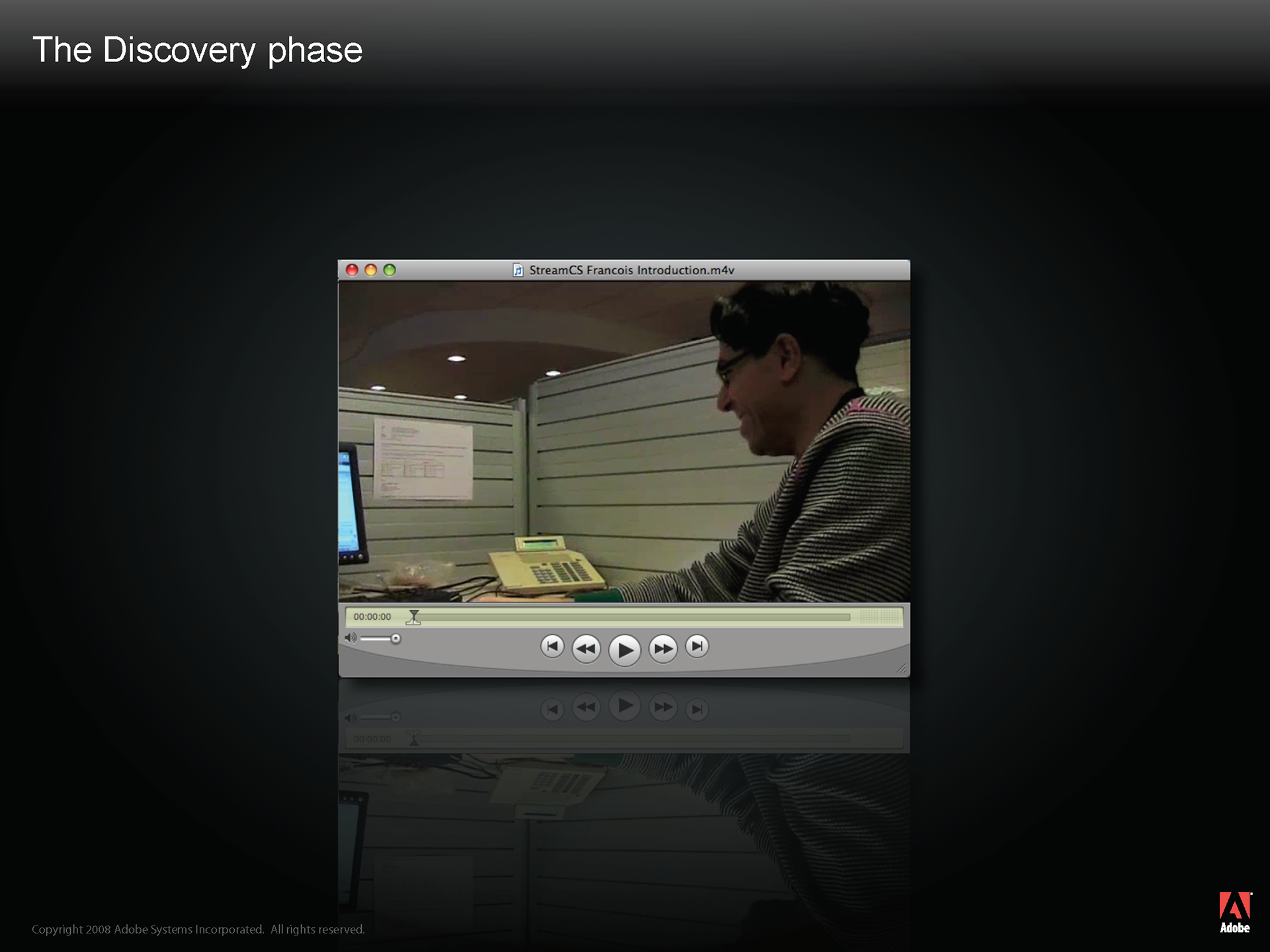
First of all we went off to the call centers and we took a lot of video of agents receiving calls from customers
We weren’t just interested in what was happening on their screens
We were also interested in what was going on on their desks, in their cubicles, how they were reacting to different customer questions etc.
We noticed that they were using a notepad and post-it notes a lot – apparently the CRM system crashed a lot, so they were having to write things down
We noticed that there was a cheat sheet of the most common process pinned to their wall
We noticed the “meercat” effect: heads popping up frantically above cubicle walls looking for help answering a question
We noticed that weighty training manuals were hidden in a drawer beneath their desk
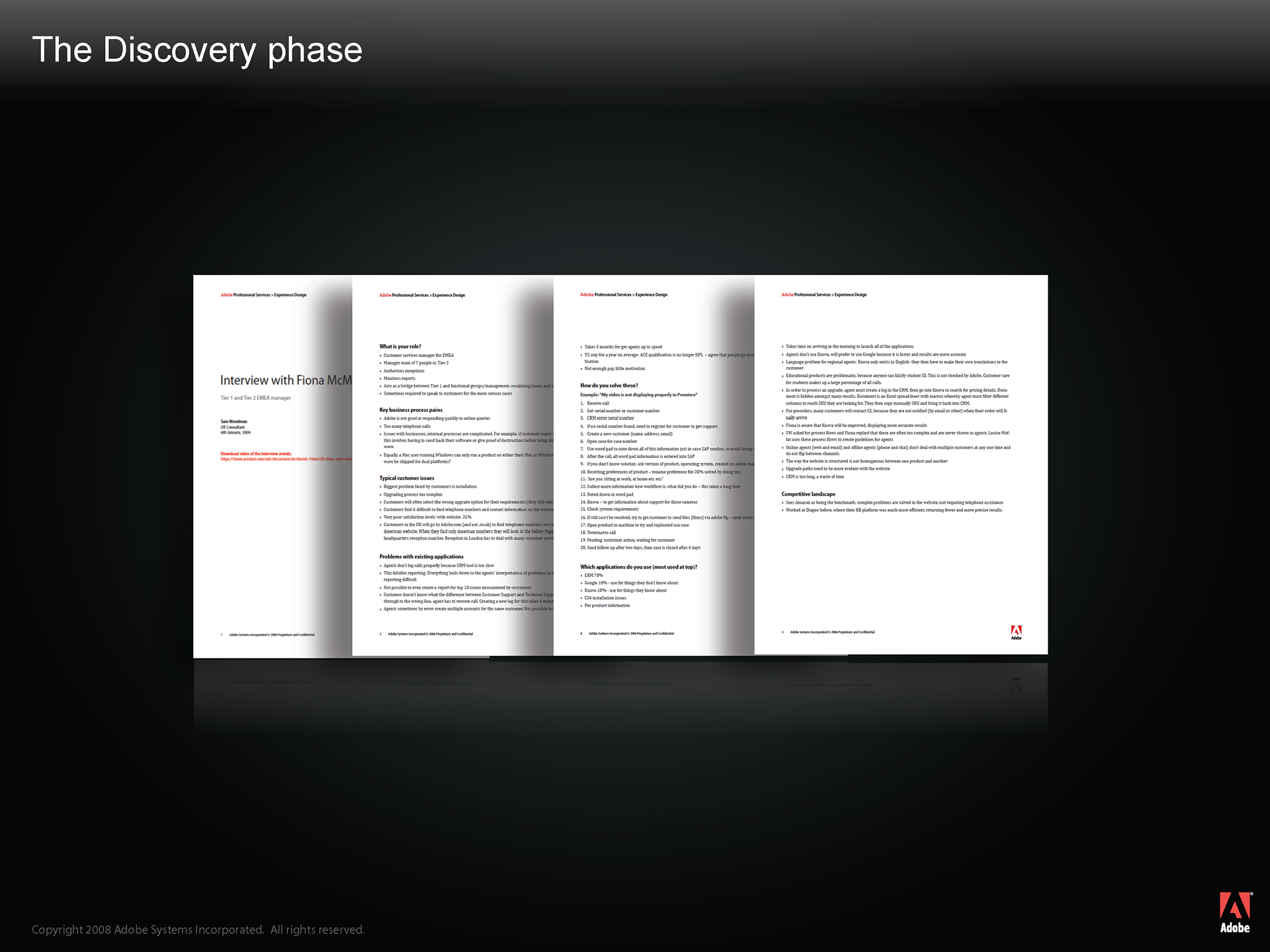
From there, we went and interviewed many more people: trainers, call center managers, Adobe managers, Adobe executive team and the project sponsors to get their view on pain points and where improvements could be made
We took a good look at the different tasks that the agents had to perform on a daily basis
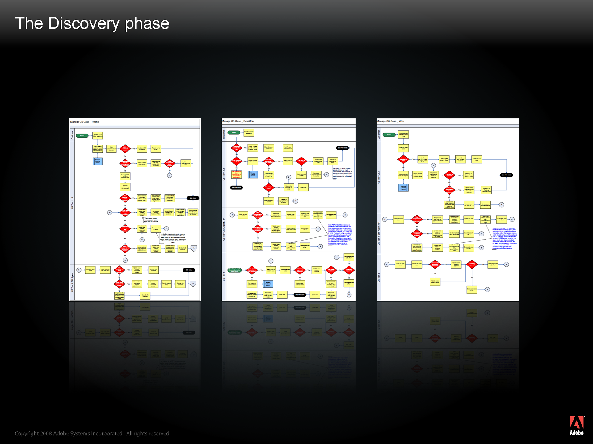
We noticed that there was much room for improvement in some of these processes.
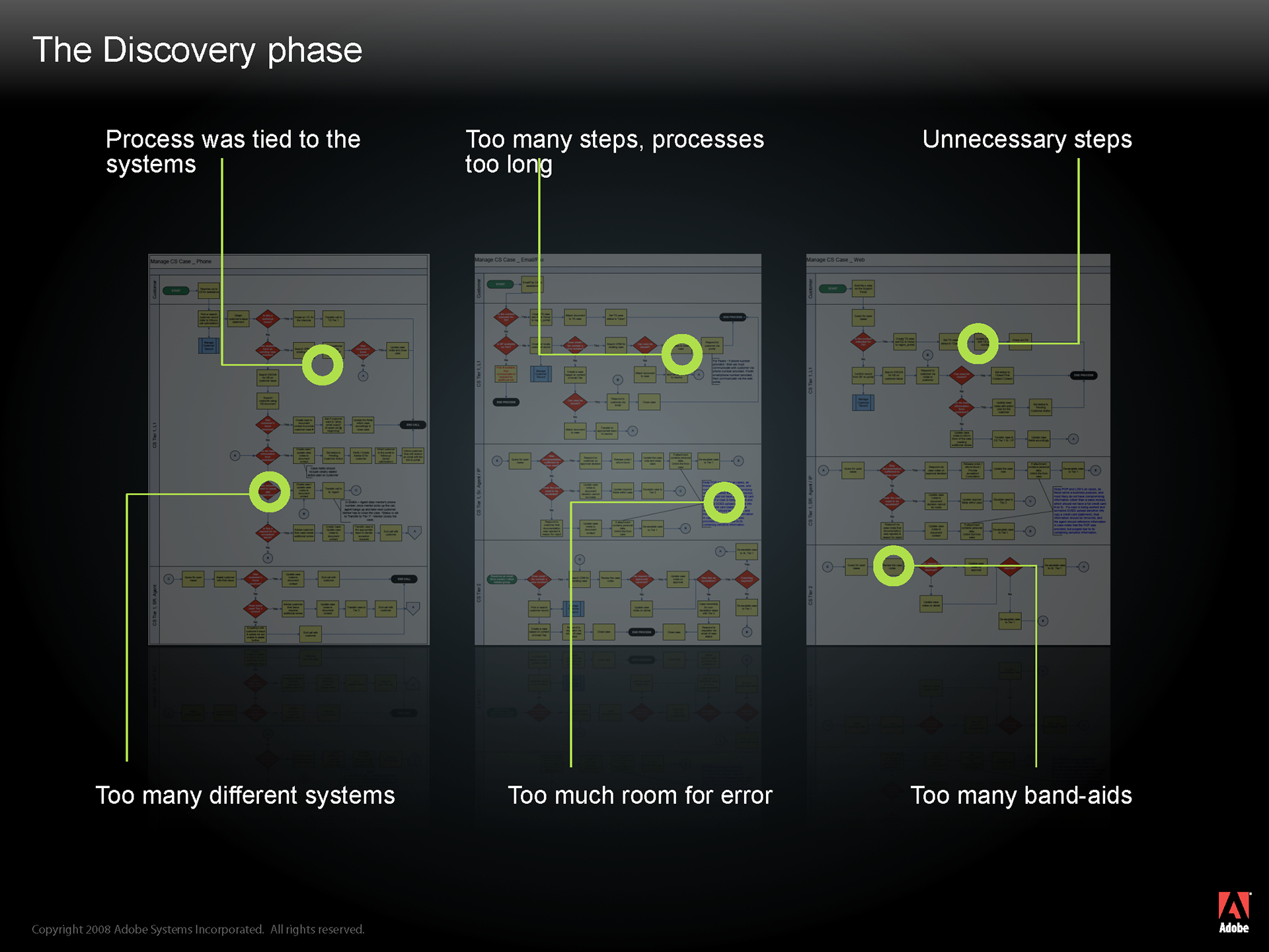
Typically, most processes were tied to the systems, meaning that a process would have to adapt itself to how a system worked and not the other way round
The steps in the processes were often too long and too complicated, demanding the agent to switch between different systems and different user interfaces
There was too much room for error between all of the systems that the agents were having to use- they were having to manually copy and paste data from one system to another
There were band aids. By band aids, I mean there were processes conceived years ago, and to adapt an old process to new requirements, additional steps were included, making it even more complex. These processes had not been entirely re-thought.
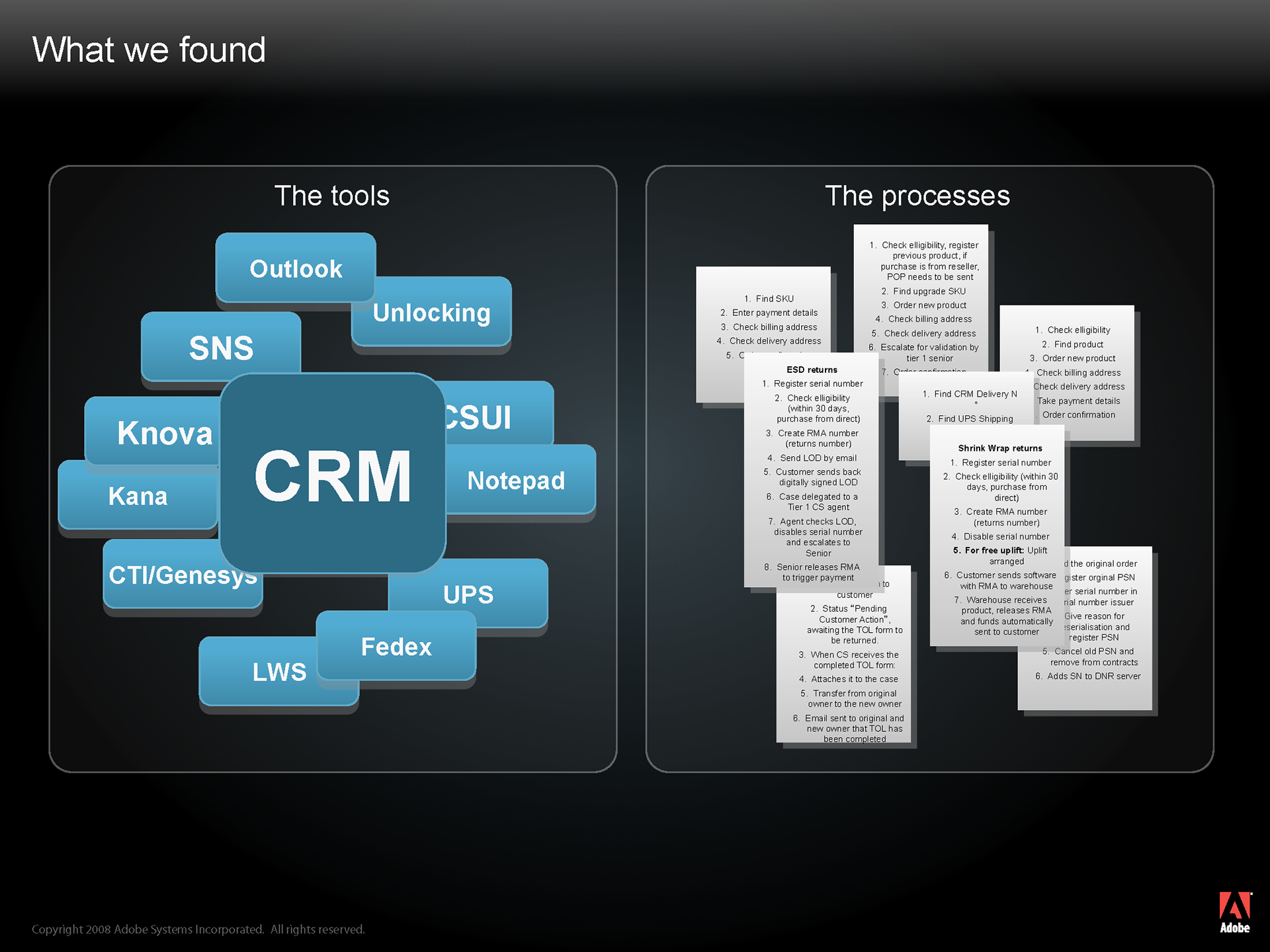
And finally we looked at the systems themselves.
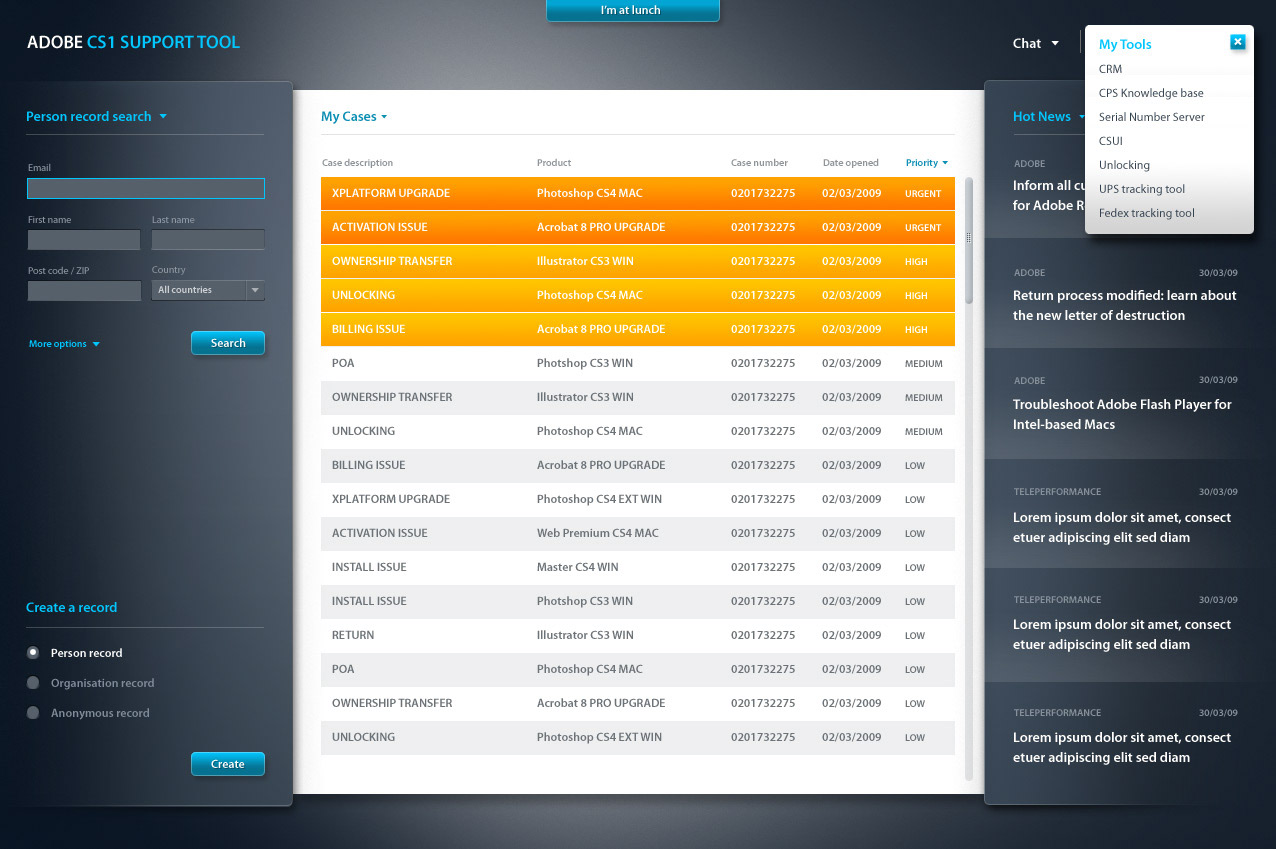
An agent had to typically use a dozen different systems throughout their daily work schedule.
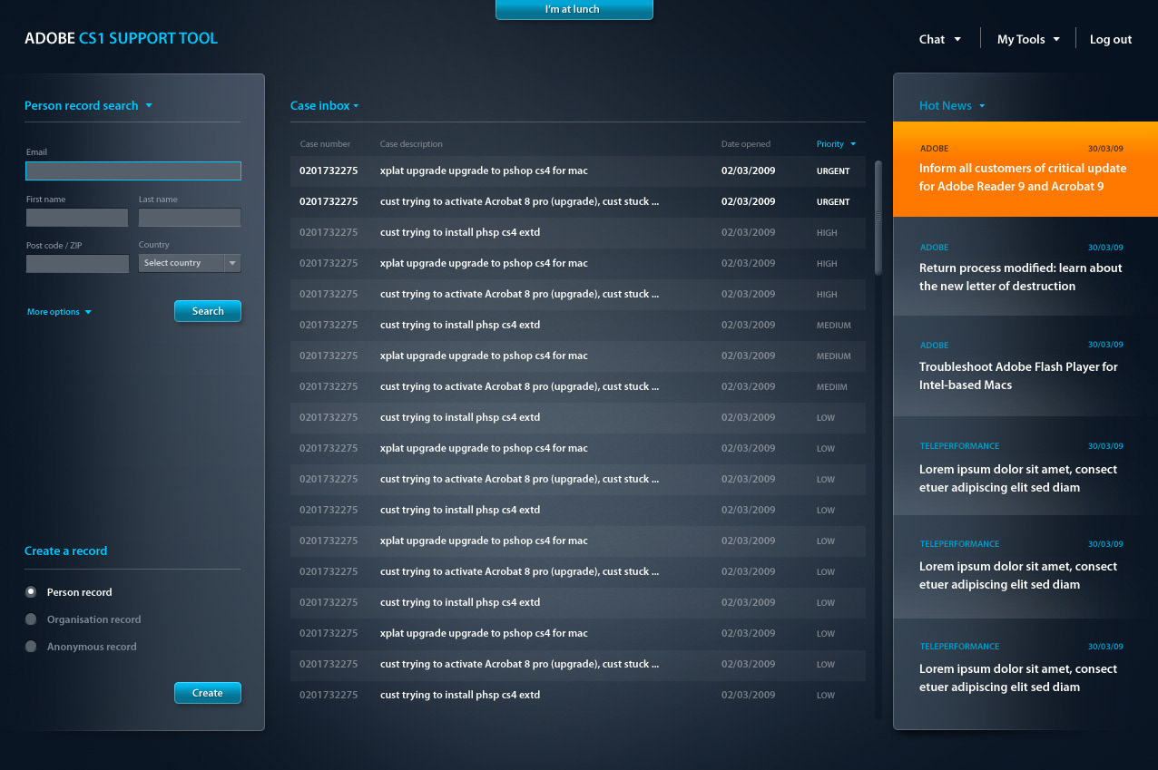
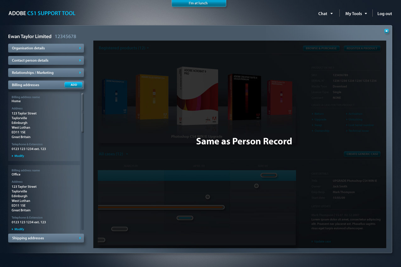
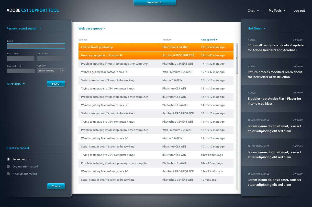
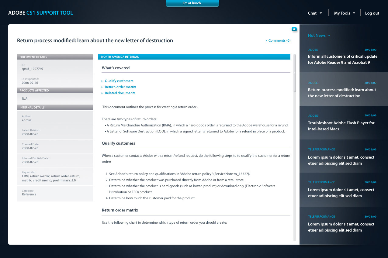
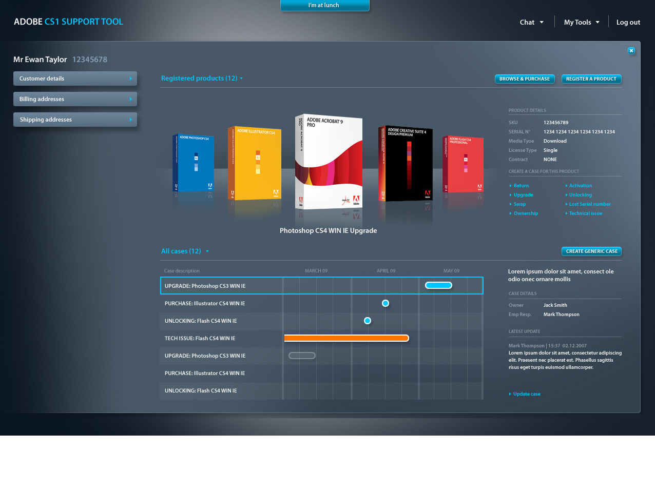
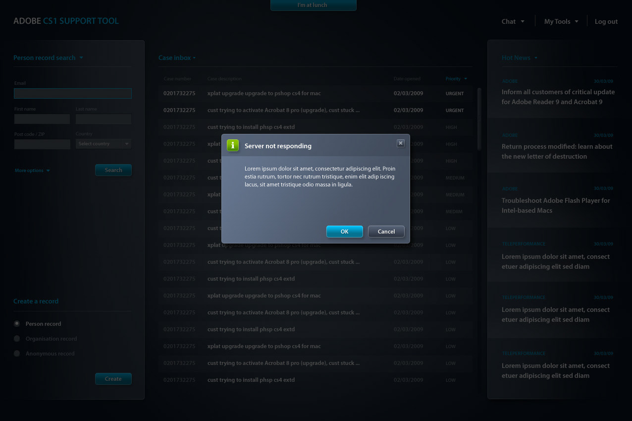
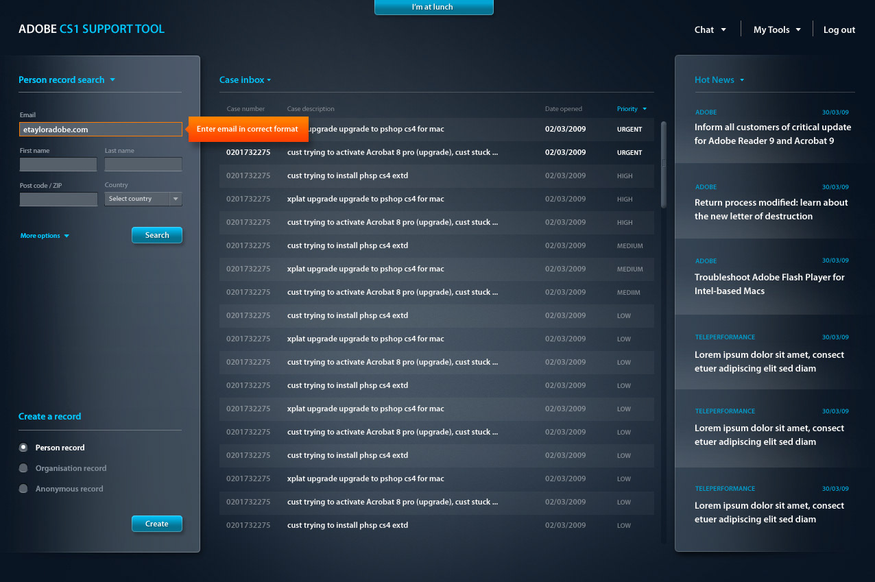
This is a screenshot of one of them: CRM
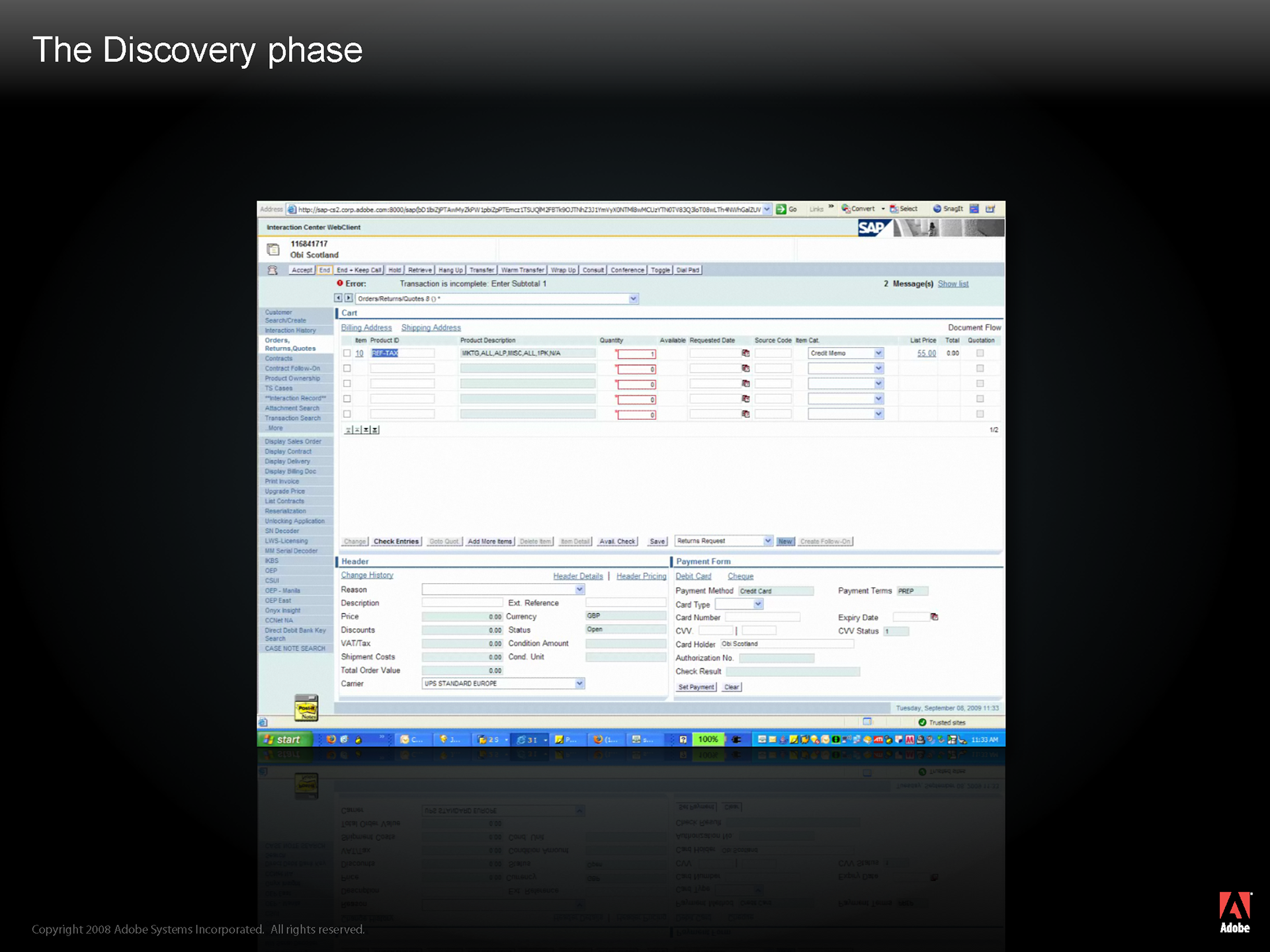
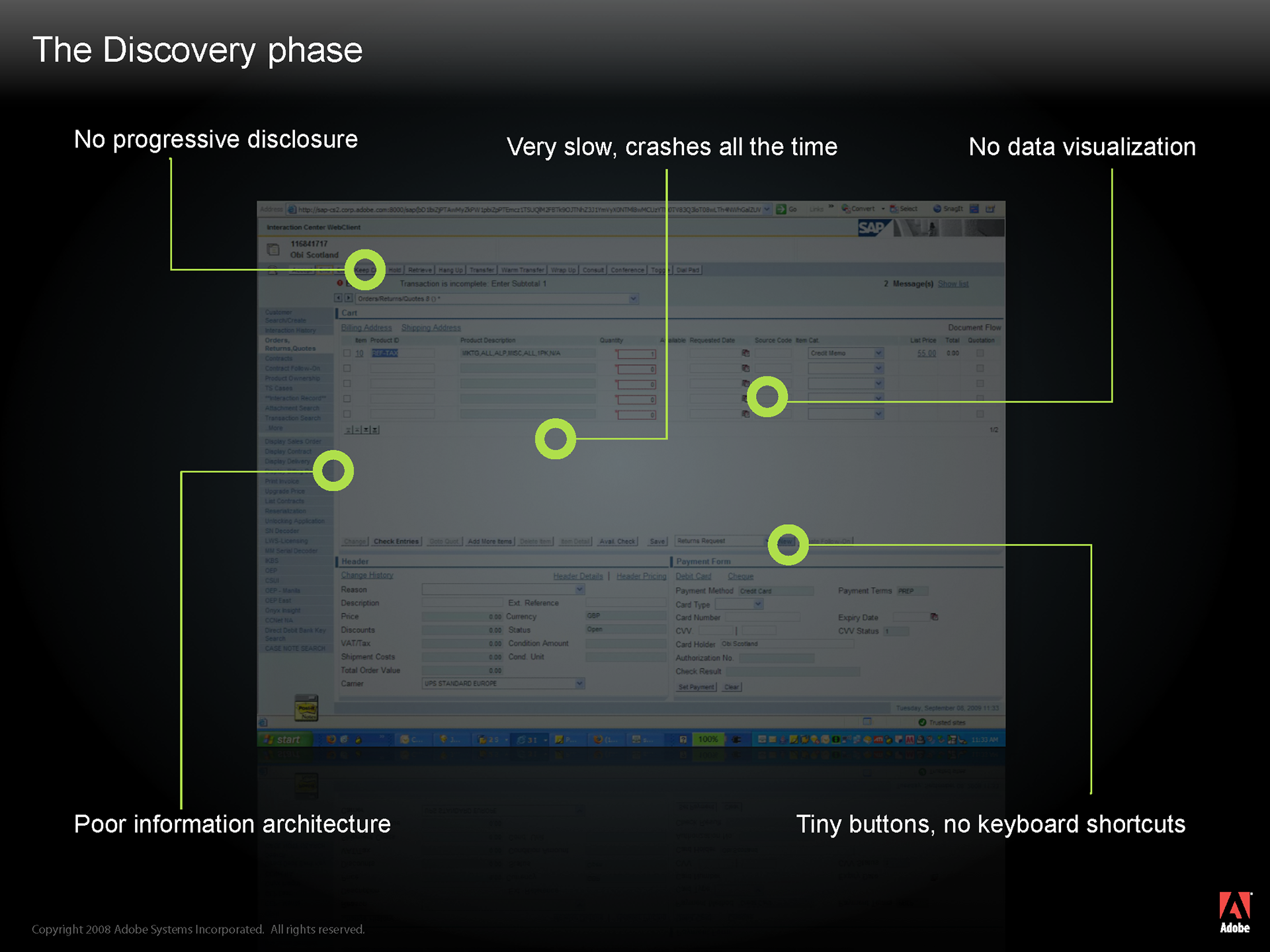
Agents had many complaints about the systems they had to use, but the system they disliked the most was CRM
CRM was slow, it crashed a lot and there were regular time out issues, meaning that agents would often lose work
There was no progressive disclosure- all of the functionality was displayed and was not filtered depending on an agent’s role or step within a particular process
There was little information hierarchy- data was presented at the same visual level, meaning that quickly scanning a screen to find something was very difficult
There was no data visualization to help agents quickly understand a given situation- just text and forms
And call-to-action items: buttons, drop down lists, navigation links etc. were very small, hard to detect and dotted all around the interface.
Our conclusion therefore was that agents had too many tools and were having to memorize too many processes
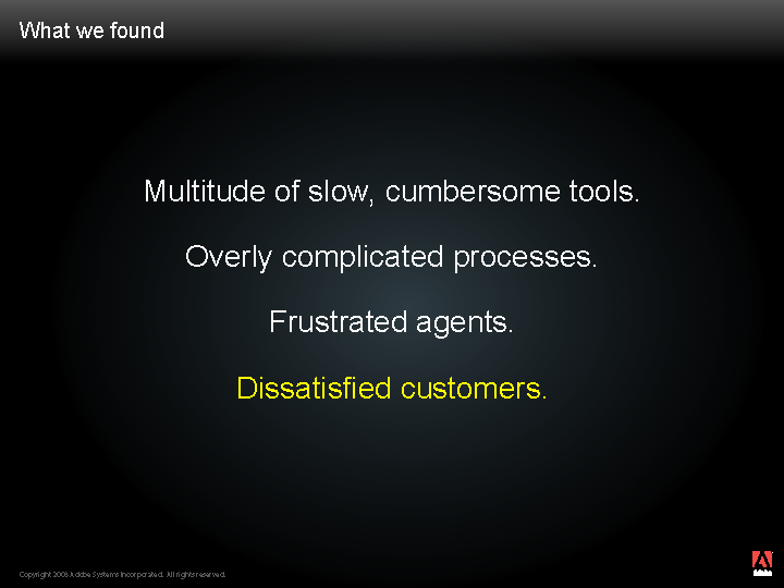
And if you have a multitude of slow, cumbersome tools and a bunch of overly complicated processes you will get frustrated agents. And this has a direct impact on customer satisfaction.
Call center management told us that they had a real problem with agent churn rate and in their view, this was directly related to the processes and tools they were having to use. We discovered that to train an agent on the tools and processes would typically take about a month, getting them up to speed would take 2-3 months and the churn rate was 6 months.
It therefore became apparent that we should be providing agents with an all-in-one, process-driven solution.
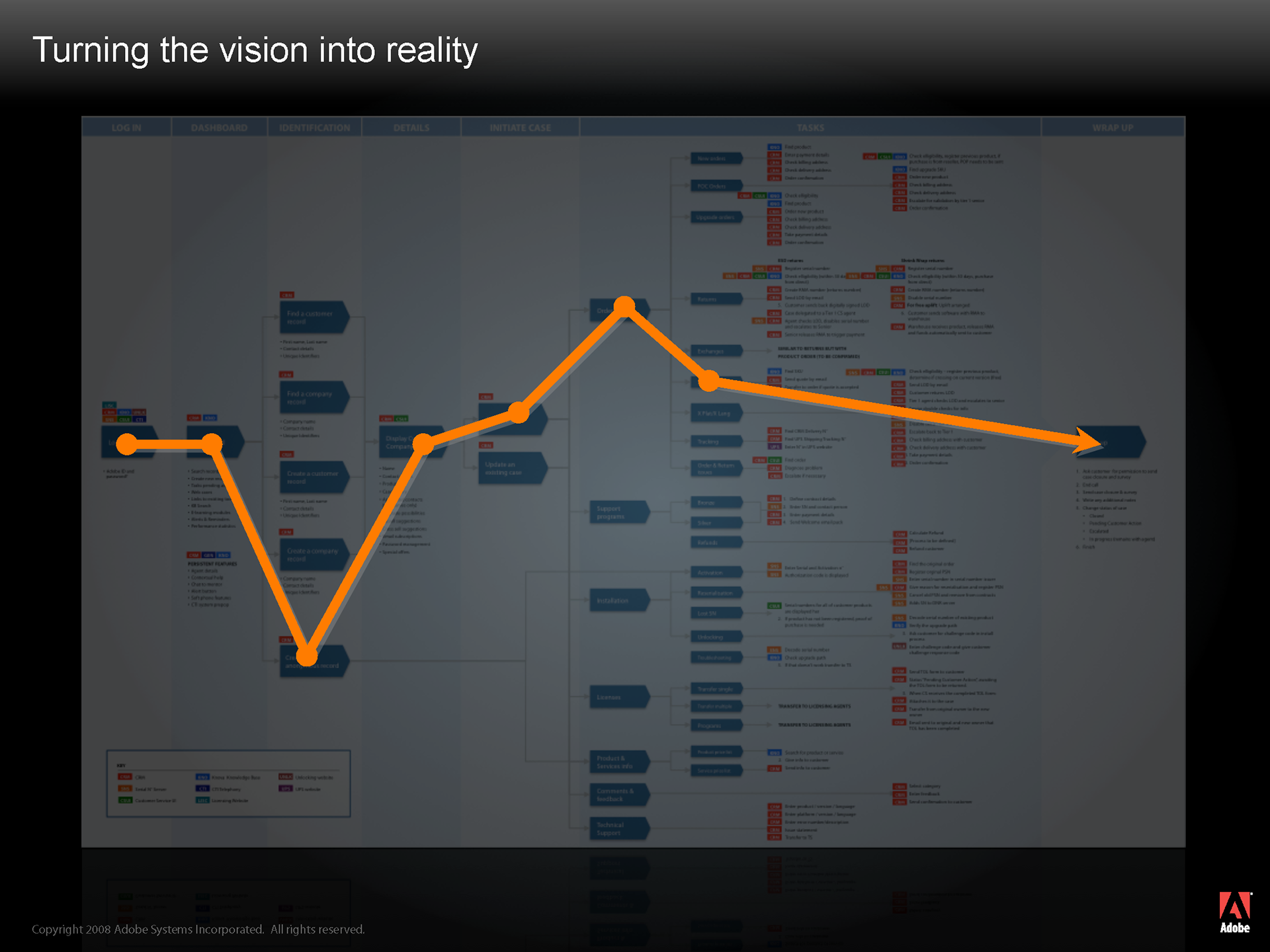
From the Discovery phase we then went into the Define phase to turn our vision into reality
First thing we had to address was the processes.
We took data from the process documents and training manuals, and plotted it out into a huge process map, so that we could take a global look at all of the different steps, actions and systems that the agents were having to use
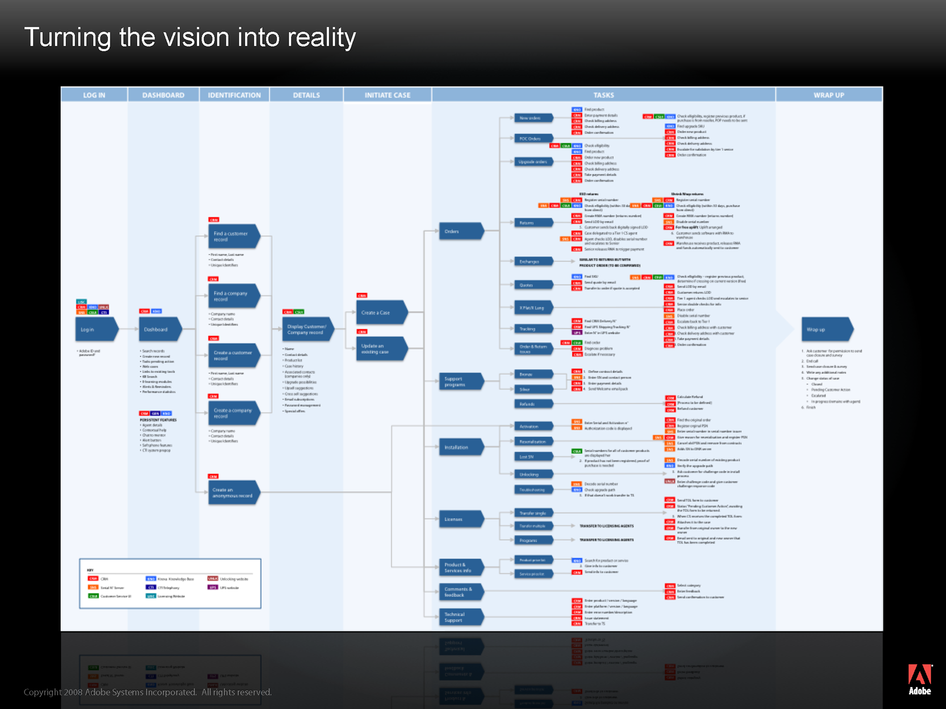
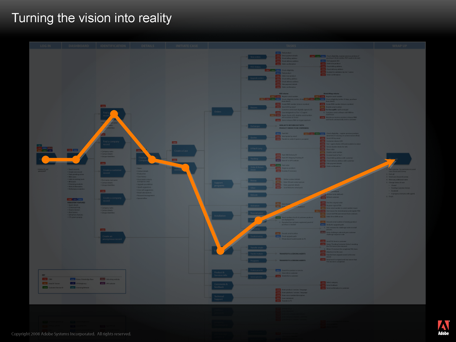
For a given task, we were then able to plot different user paths over the process map
And then we were able to understand how we could eventually optimize certain processes, creating shortcuts, deleting steps and essentially compressing the time need to complete any given task.
Discovery phase in more detail
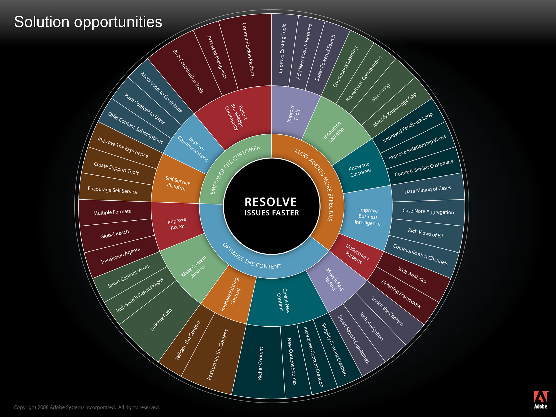
Solution opportunities identified during the Discovery phase
Discovery phase in more detail
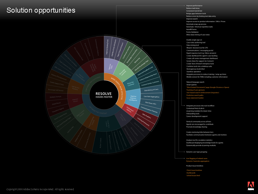
Solution opportunities identified during the Discovery phase
Discovery phase in more detail
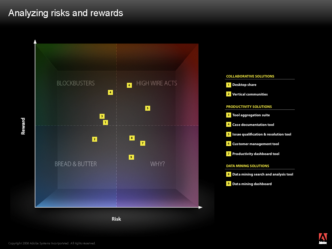
Risks and Rewards identified during the Discovery phase
Once we had gained a better picture about how we were going to improve processes, we could then start to create the user interface.
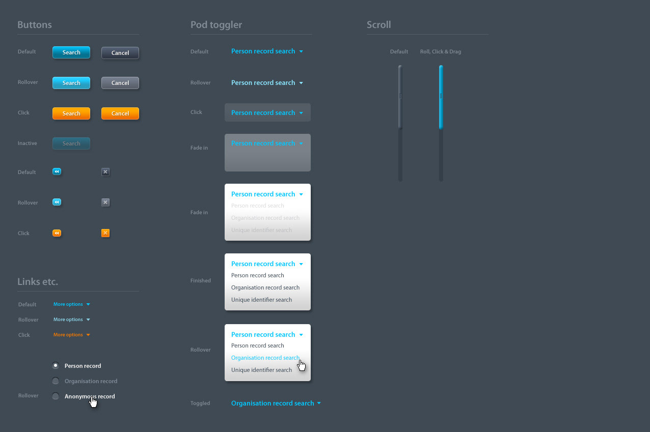
The first step in creating an interface is the wire-framing phase
This is an essential phase as it allows a designer to rapidly create a multitude of different scenarios and user paths without thinking about the visual design (these are often in monochrome)
Very early on, designers will then test these different scenarios on real users. The fact that the wire-frames are basic monochrome mock-ups means that users will concentrate on functionality rather than aesthetic appeal and this will glean important feedback about the functionality before the visual design stage
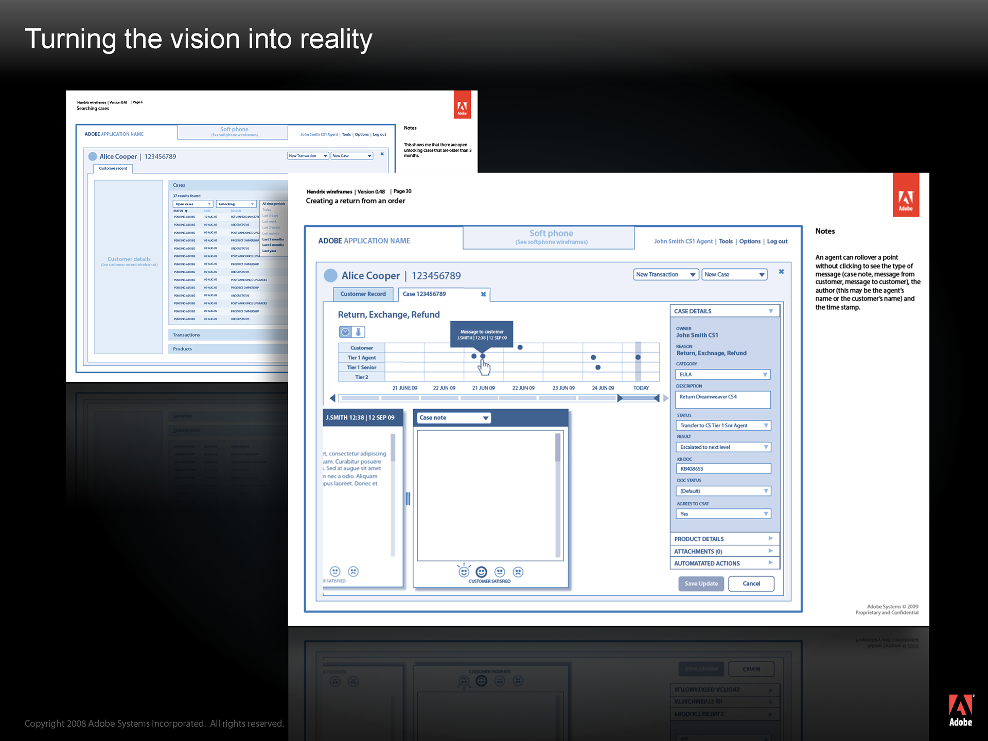
Once the wire-frames have been approved by users, business and project stake holders, they are then transformed into a visual design
A visual designer will use color, iconography, layout and choreography to create visual hierarchy and visual cues within an interface, bringing to the forefront the elements that the user needs at any given moment.
A prototype was also produced, allowing for a real sense of how the application would appear under a set of different scenarios.
The visual design mock-ups were approved by users, business and project stake holders before passing off to the development team.
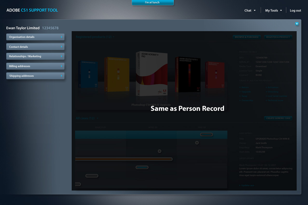
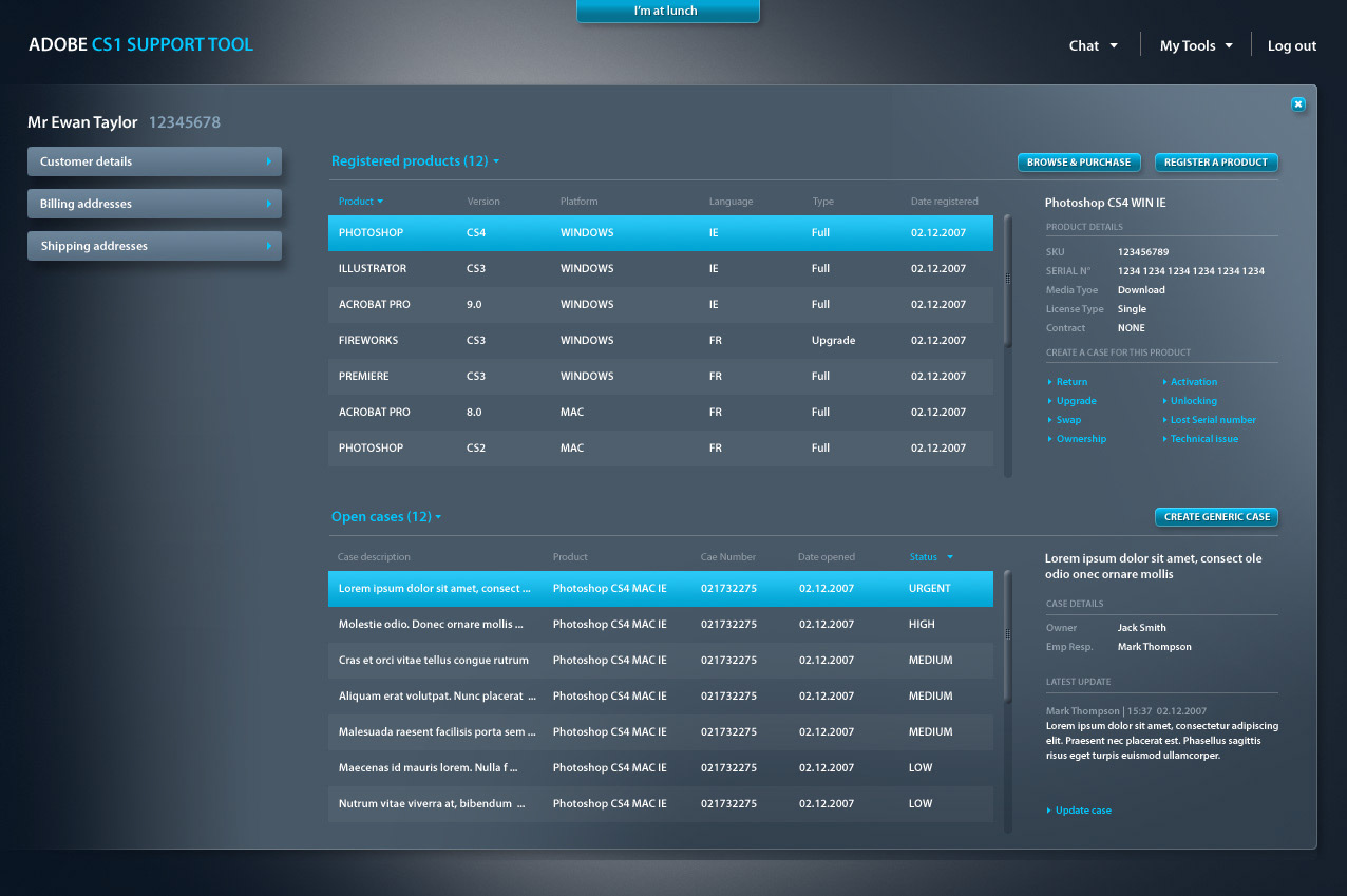
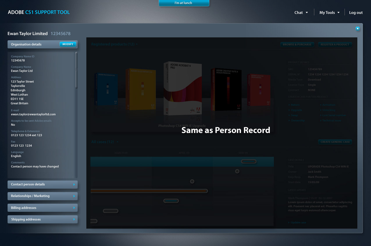
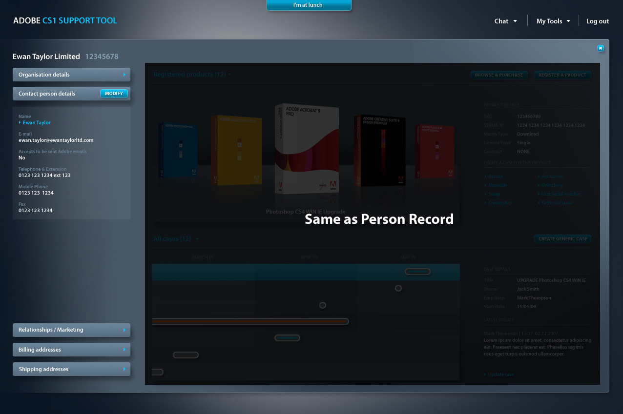
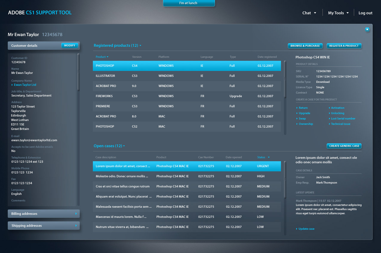
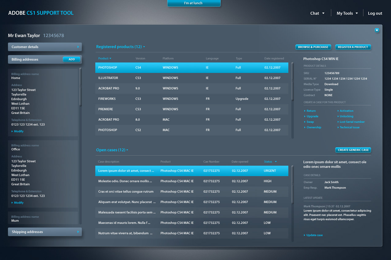
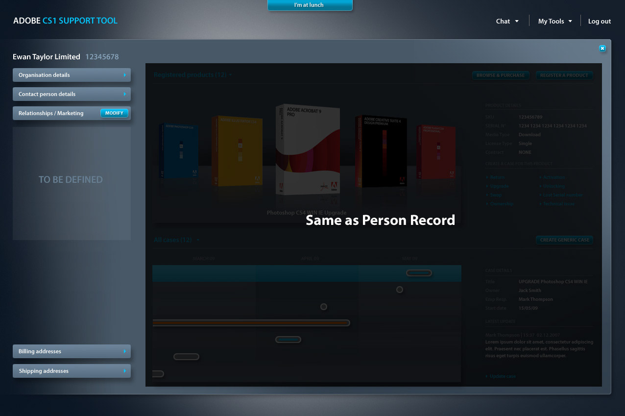
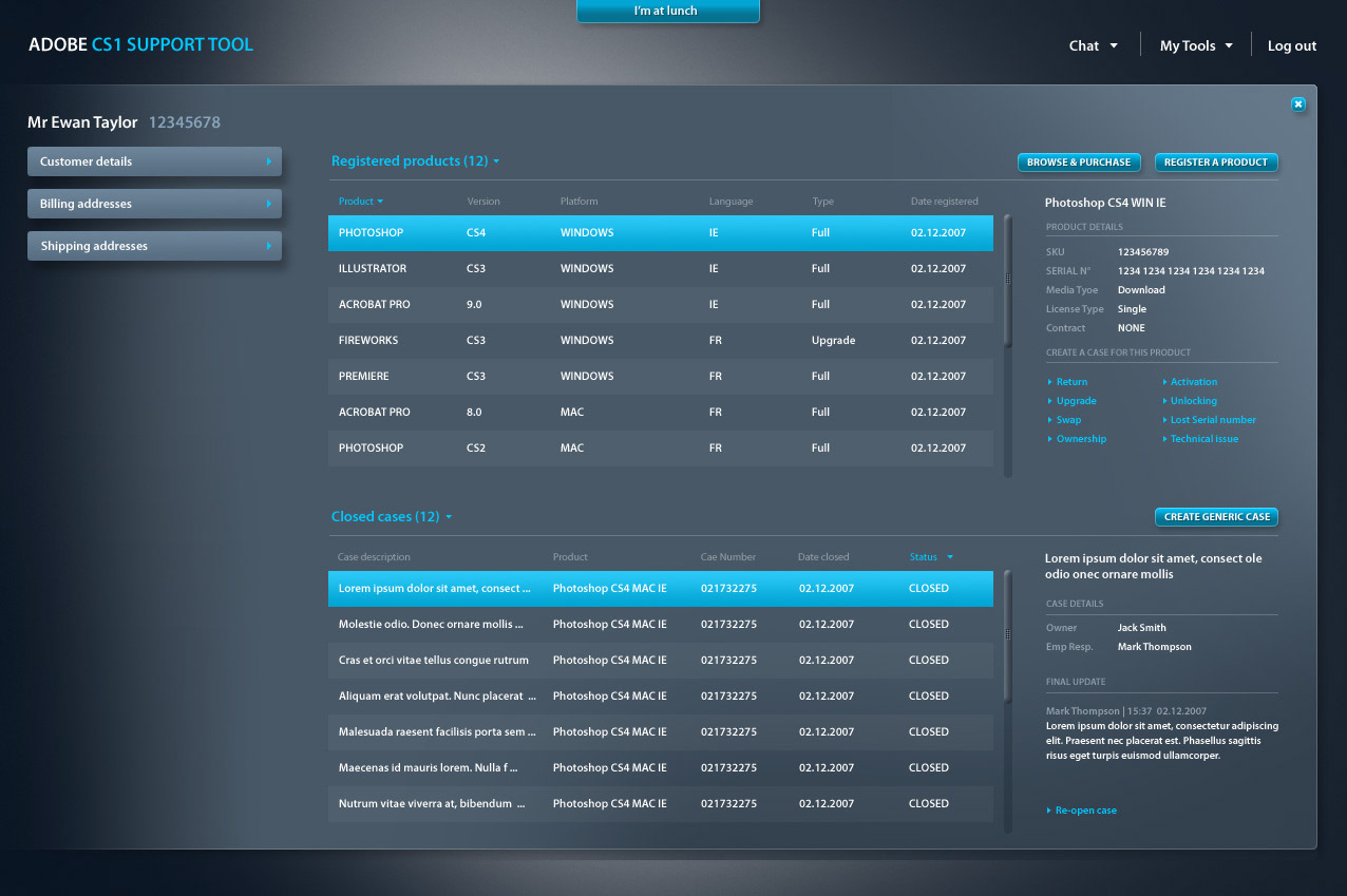
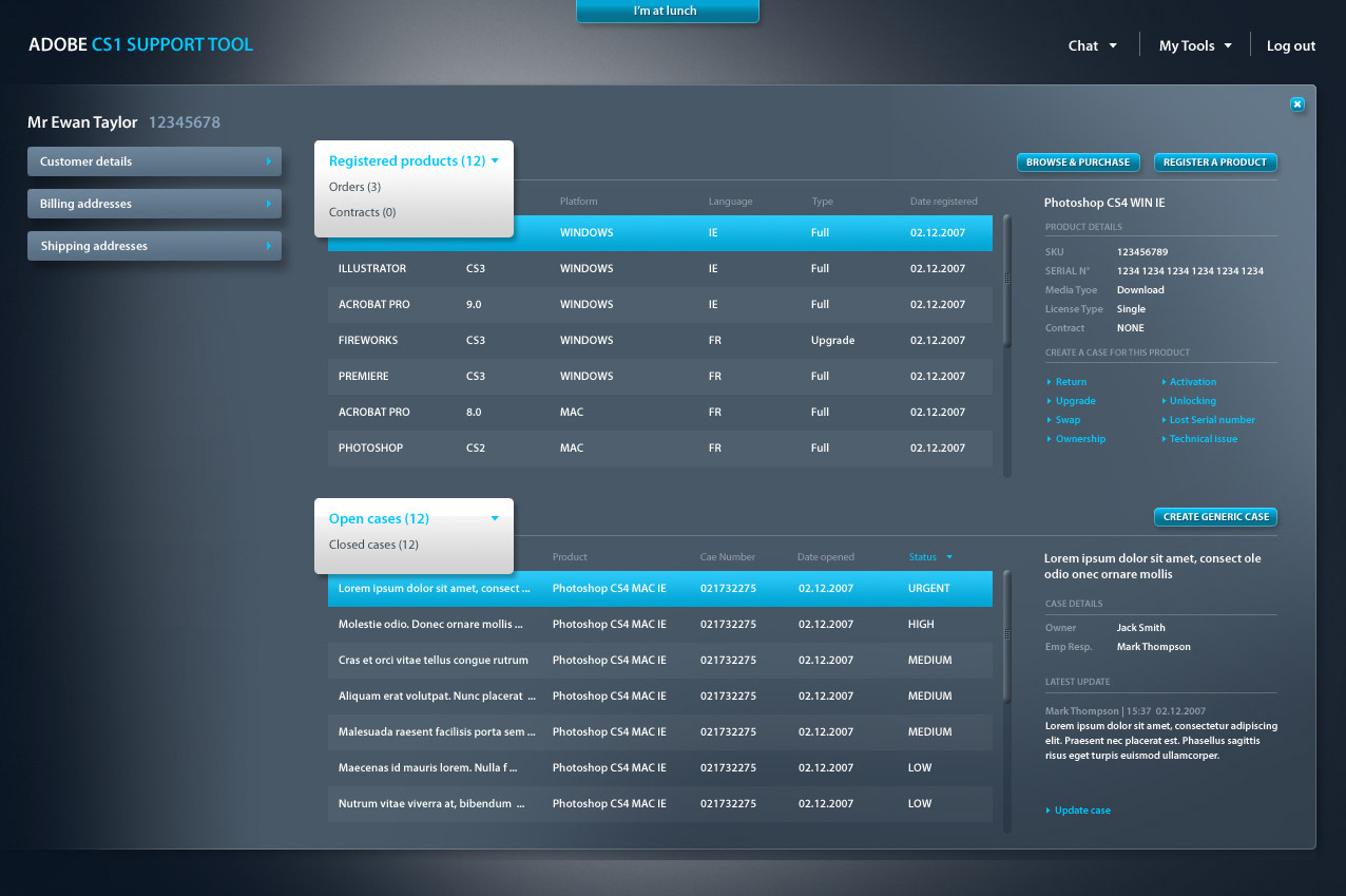
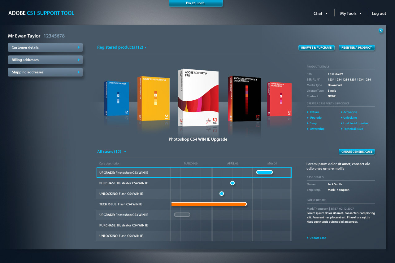
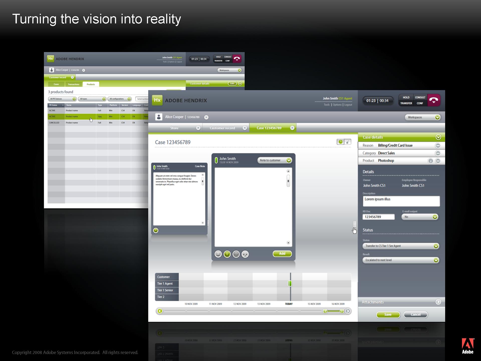
Before and After
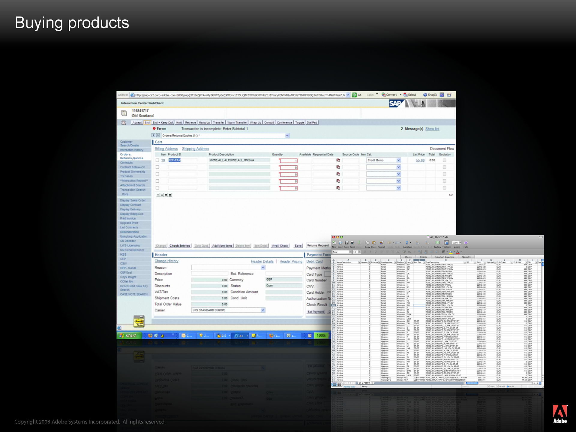
Selling in CRM isn’t easy.
Firstly, a sales agent would have to go the Adobe website to relay information about products, upgrades, cross sells, up-sells to the customer.
Then, to process an order for a customer, an agent would have to go into our knowledge base to download the latest price list spreadsheet.
They would then open the spreadsheet and trawl through the 2000 rows to find the SKU code to enter into CRM
Once entered into CRM, a price would be returned and the agent would collect the customer’s contact and payment details and process the order
For an extremely simple purchase, an experience agent would take about 4 minutes
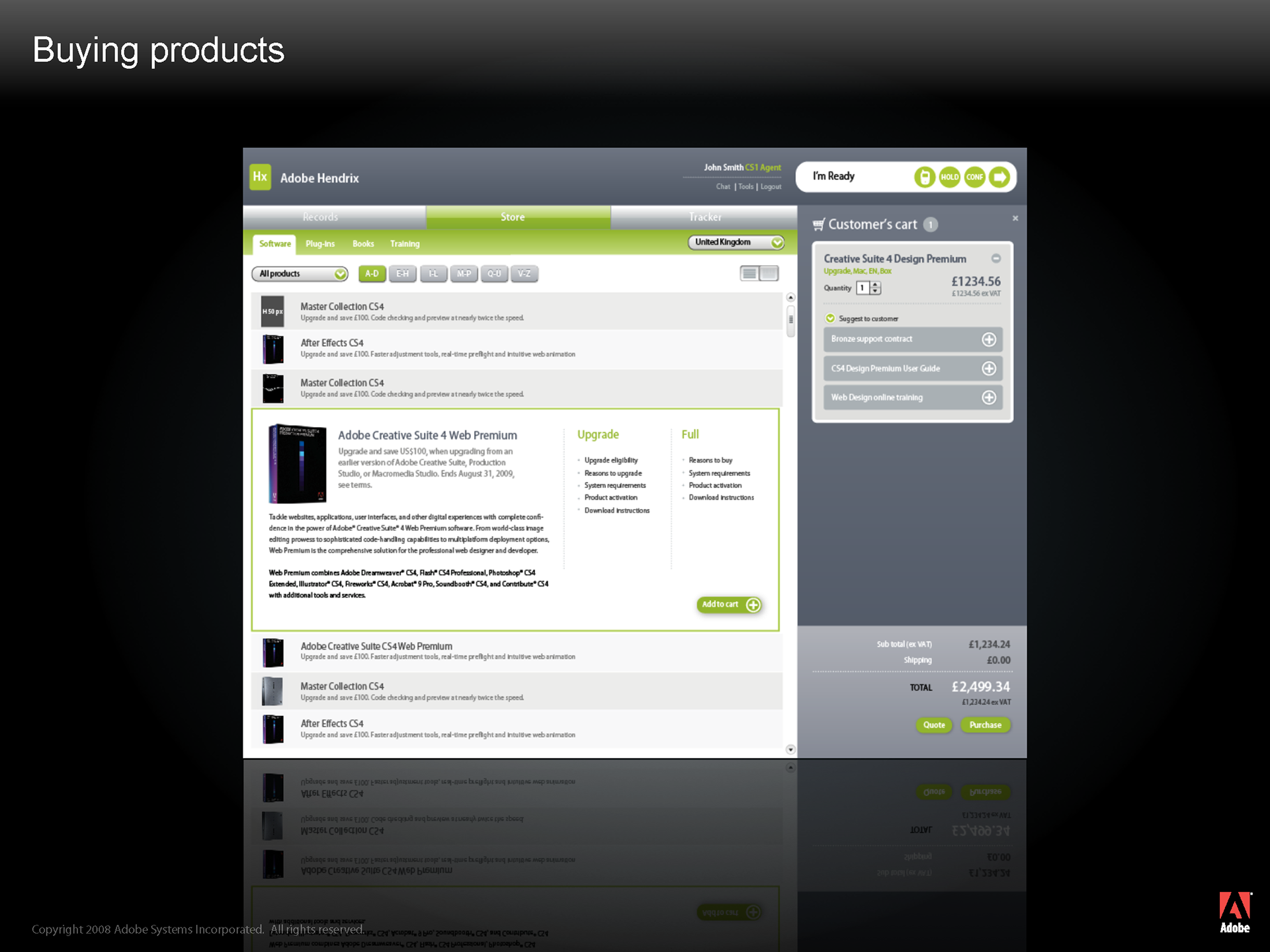
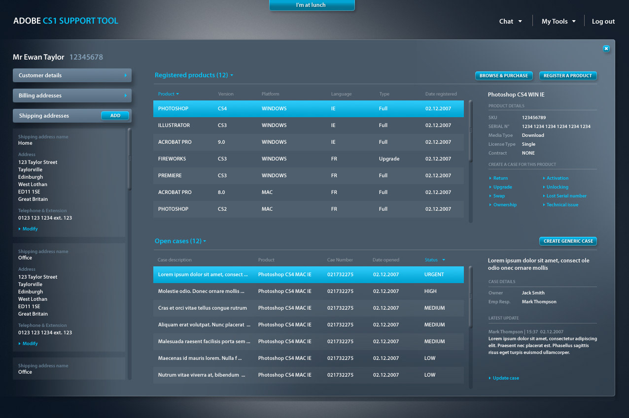
In Hendrix, we aggregated all of that selling functionality
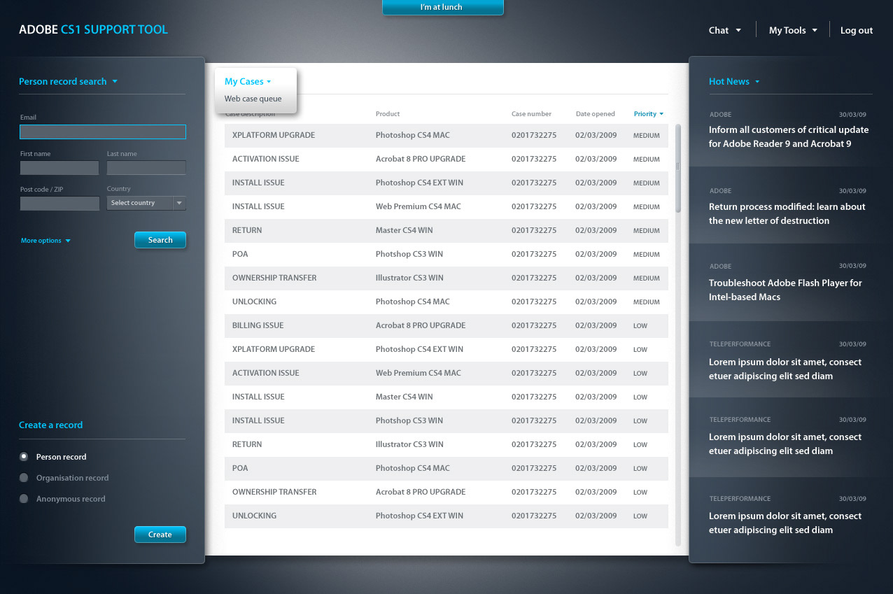
An agent can quickly locate the required product in an easy to use catalogue-style interface
Clicking on a product will expand to give more information and this can also be used for training purposes
Adding the product to the customer’s cart will first involve configuring it (ie selecting the language, platform, version etc.) and at this stage the agent will be proposed with an up-sell product that they can try to convince the customer to purchase instead
From the cart, a number of cross sell products are also proposed
When the customer is ready to purchase, the agent identifies the customer, finding or creating a customer record and then processes the order
This entire process takes a minute. This is a 75% reduction compared to the same process before
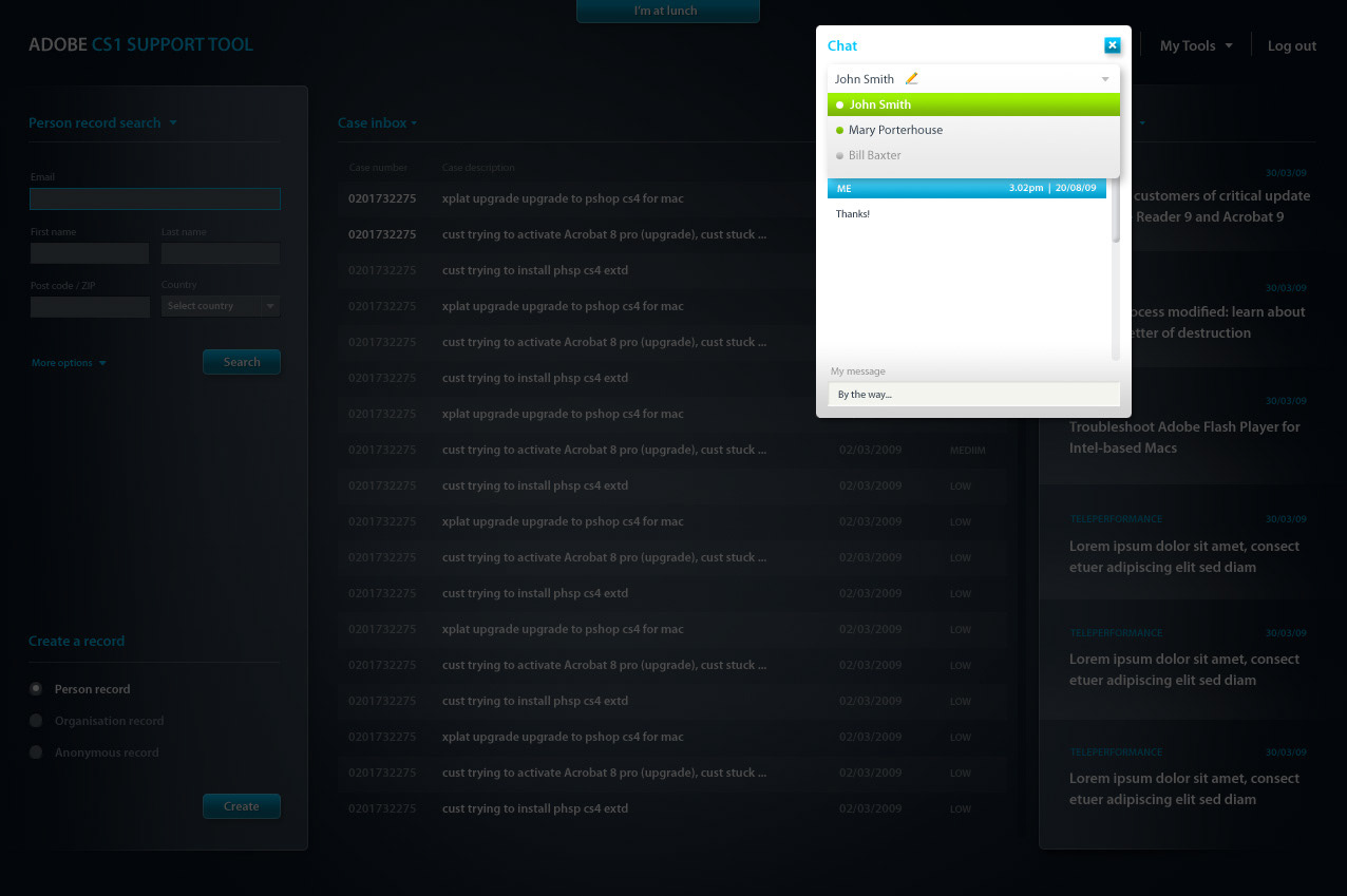
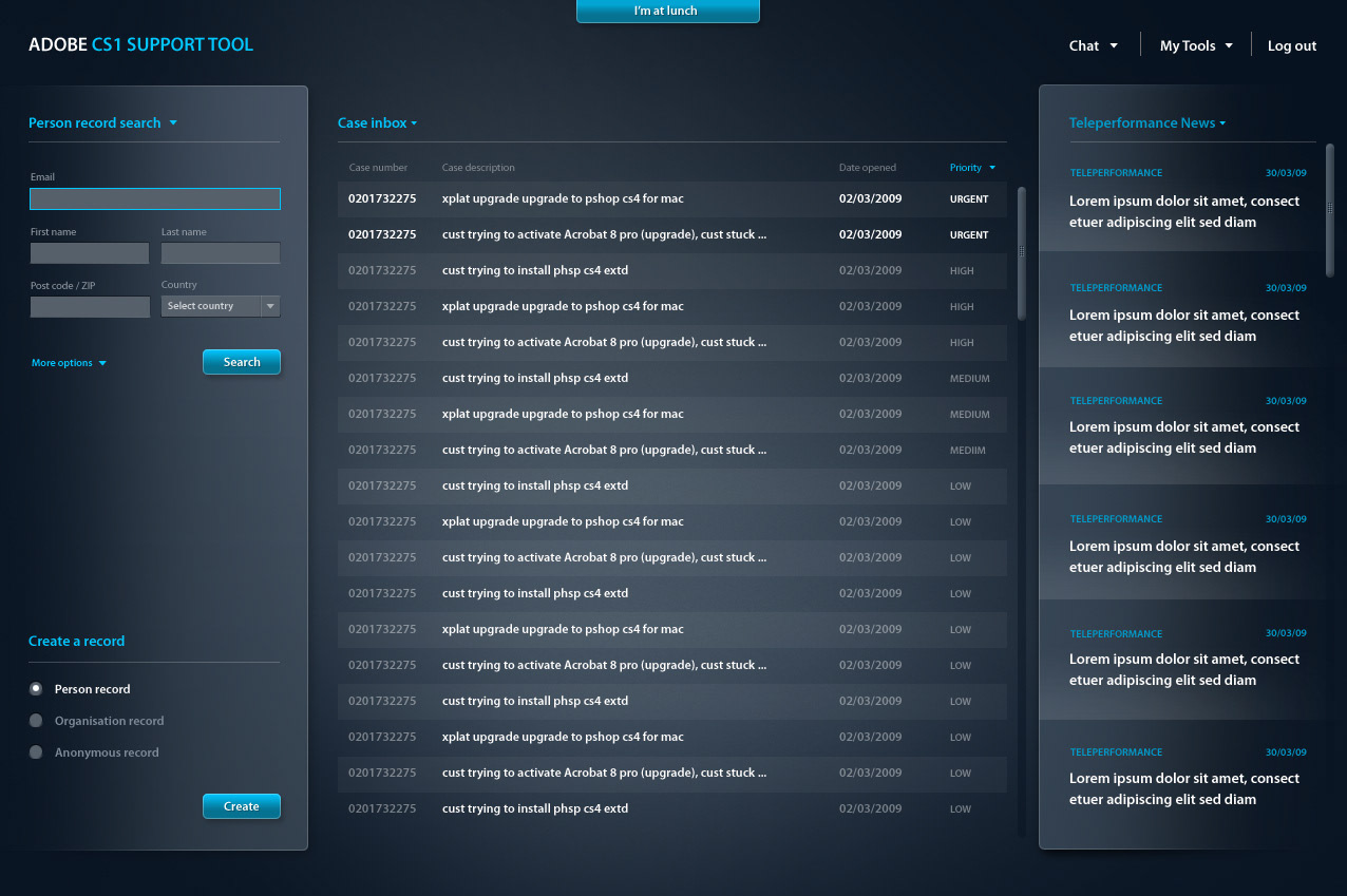
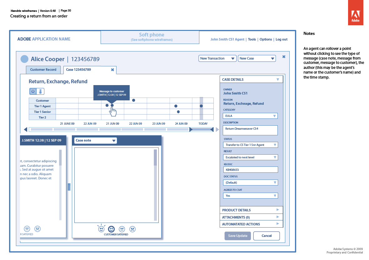
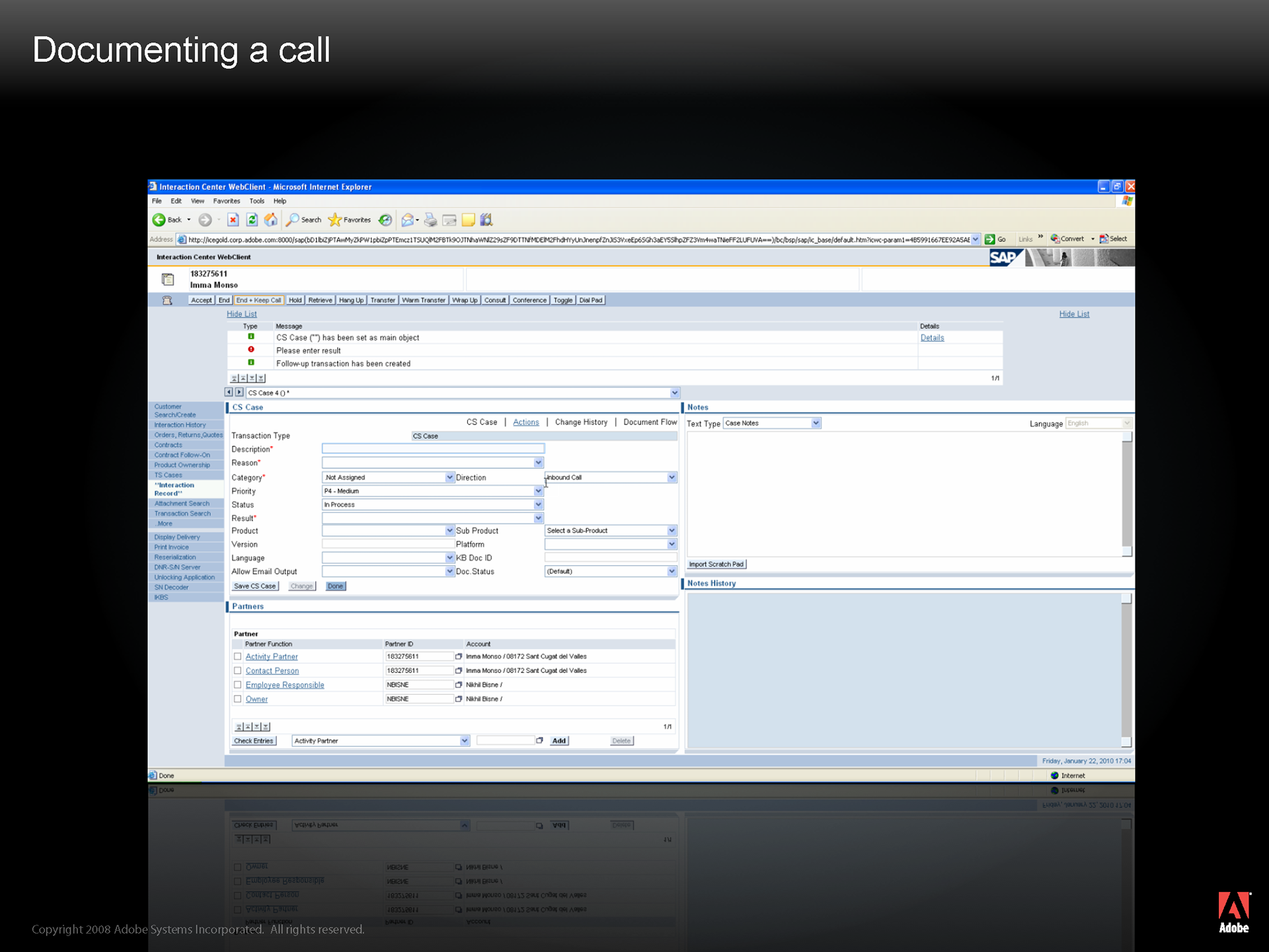
For all interactions with the customer, an agent will have to document these within case notes.
In CRM this requires having to configure a bunch of different drop down menus, and typing out the details of the interaction in the case notes field.
As well as this being very time consuming, there are other problems too.
As the majority of the captured data is hand typed, this is problematic for data mining, as no two agents will use exactly the same phrase to describe a similar problem.
As CRM is prone to regular crashes, an agent will note down the details of the interaction first in a notepad and then transcribe all of that information after the call is finished into CRM
An agent can spend up to 5 minutes wrapping up a case in CRM after they’ve finished the call with the customer
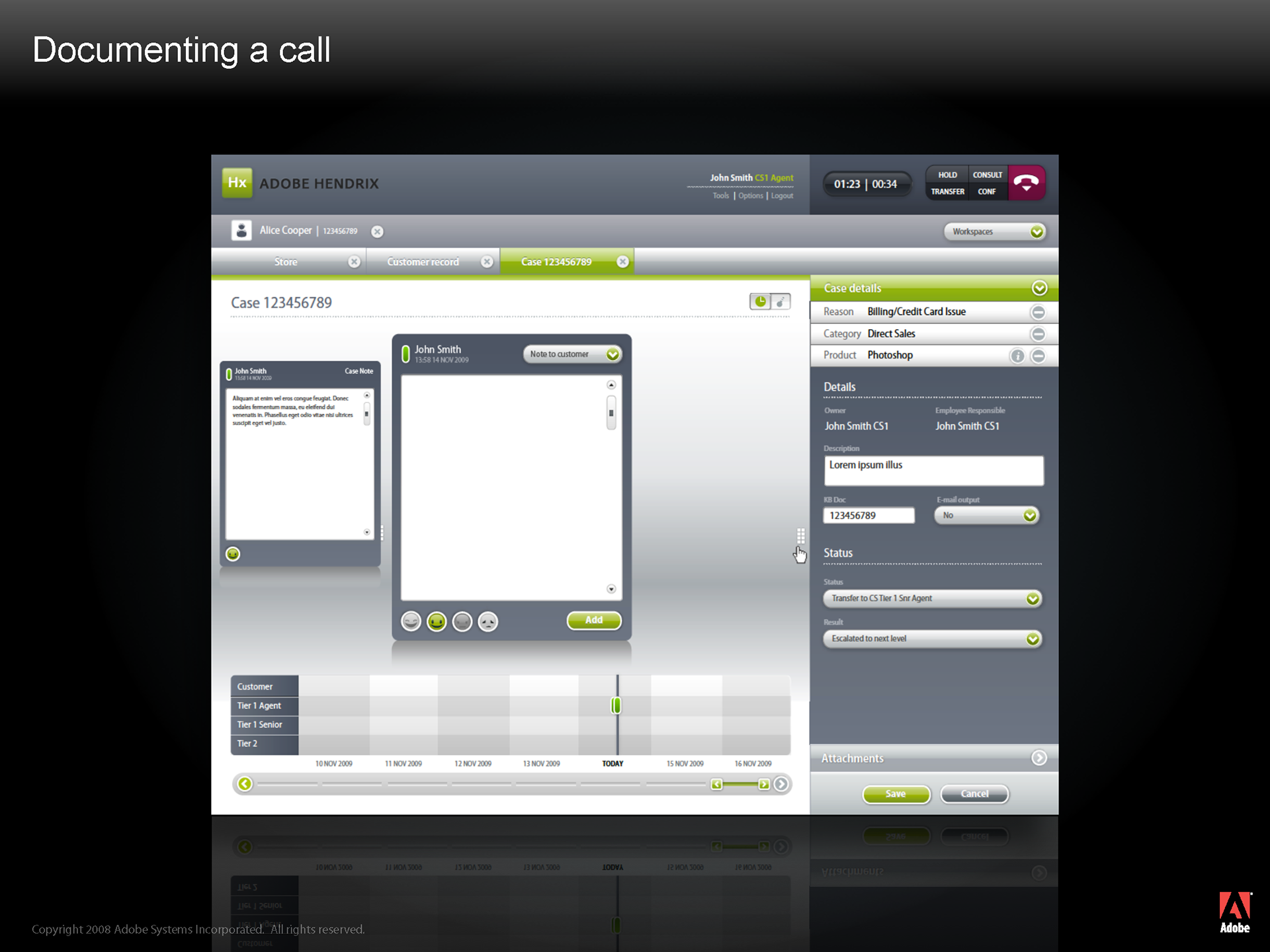
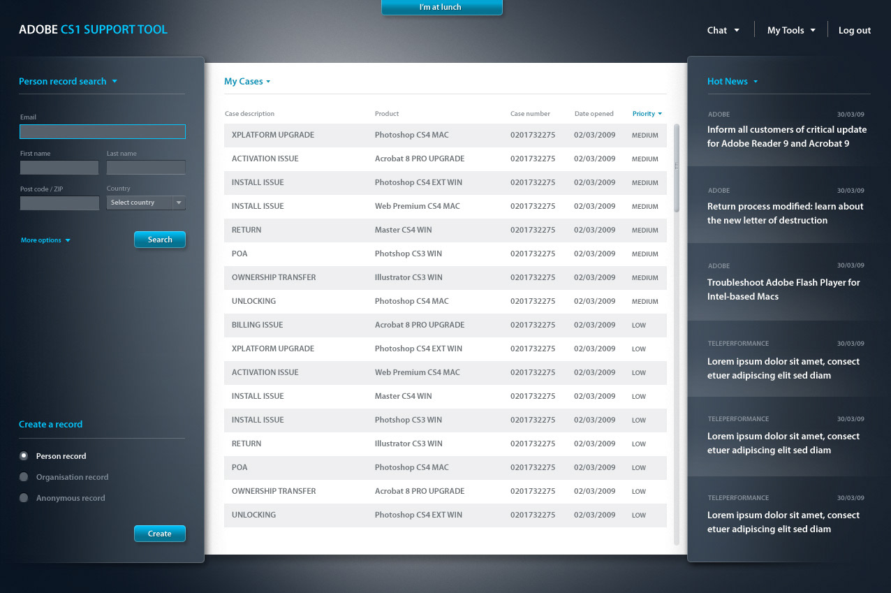
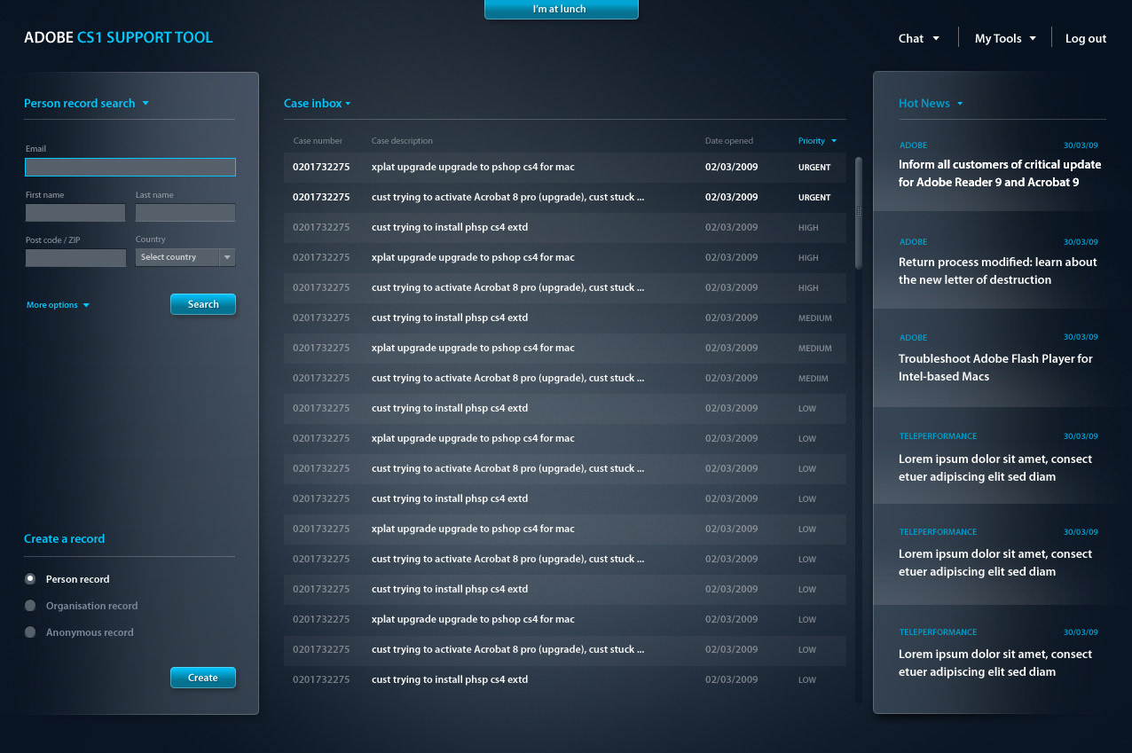
Hendrix allows the agent to complete case notes during the call with the customer
A process wizard allows the agent to quickly configure the case depending on the customer’s issue
Case notes are then automatically pre-populated the case pod (functionality to be implemented in future release)
This will mean that for the majority of cases, agents will no longer have to type out notes. As these notes are system generated, they can easily be data mined as well.
Wrap up time is therefore greatly reduced, allowing agents to get on the next call.
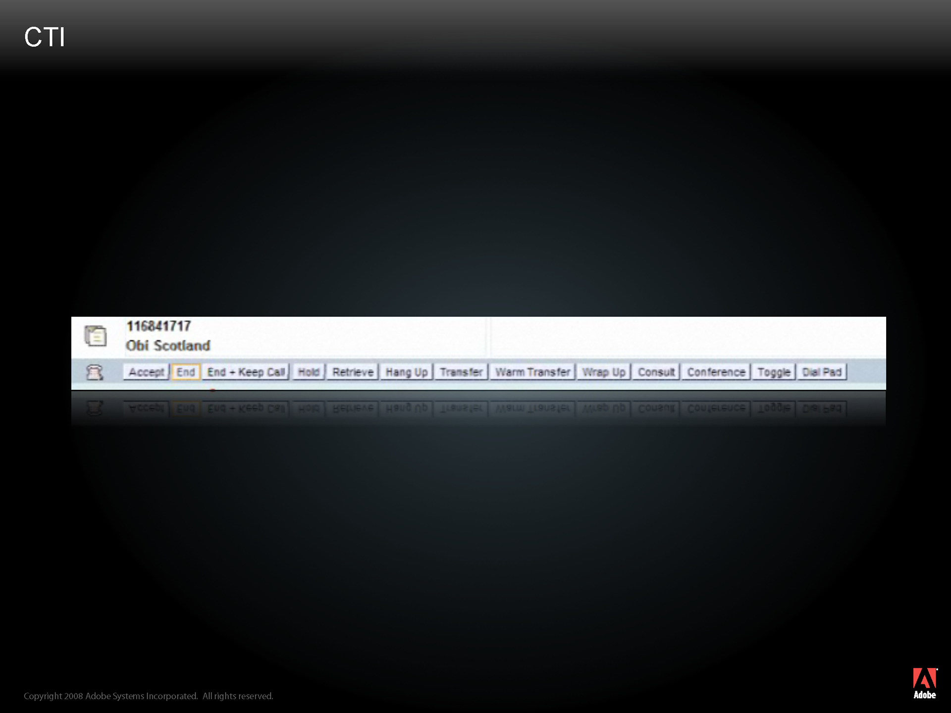
Using the softphone feature in CRM is not easy
A dozen buttons are displayed to the agent
The buttons are small and there are no icons to distinguish between the different functionality.
Mistakes happen often.
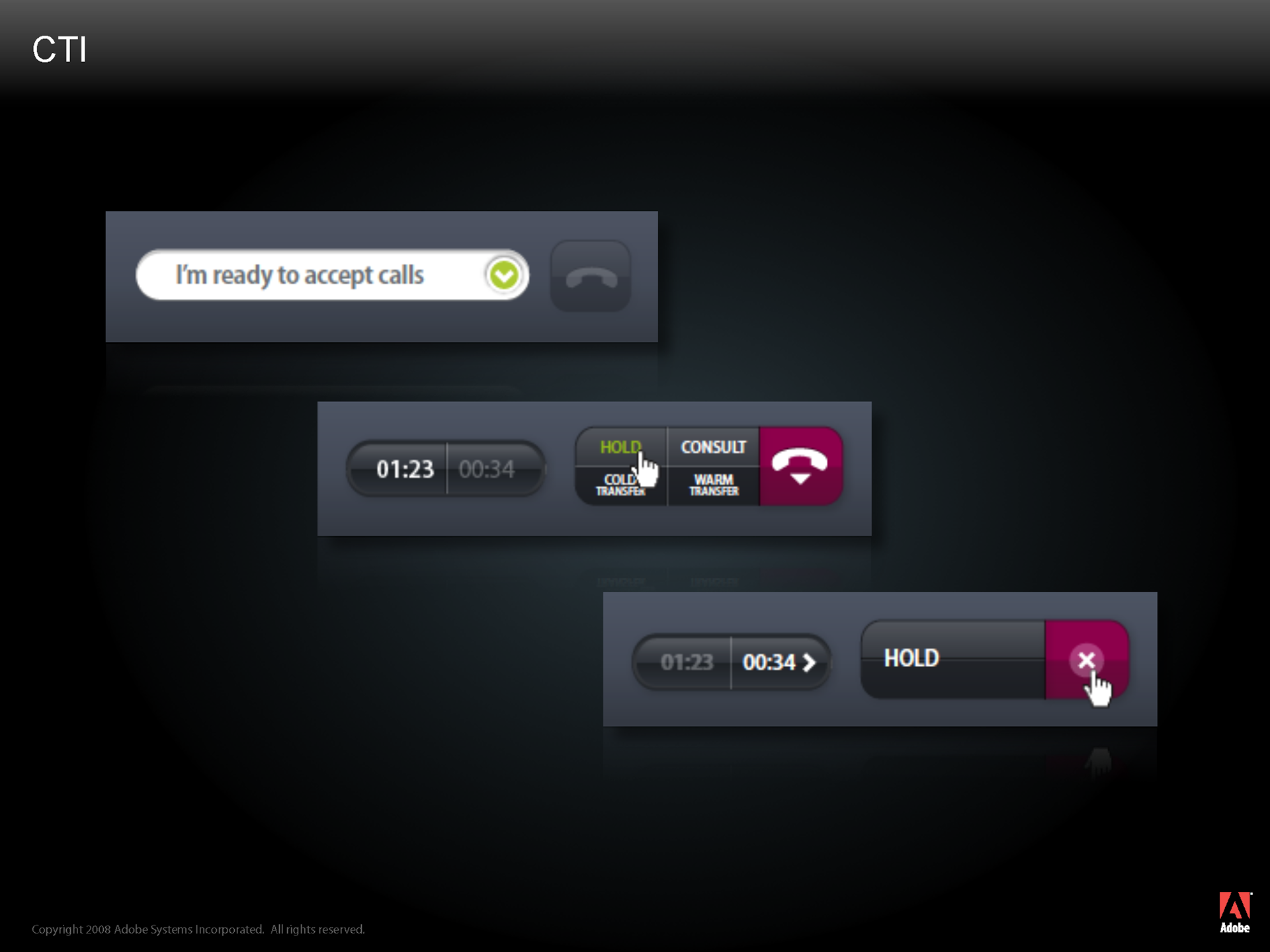
In Hendrix we designed the softphone feature using progressive disclosure.
When an agent is not on a call, they have to select a state (I’m on a break, I’m taking a training course, I’m ready to take a call, etc). We therefore display only the state selector and no other buttons
When an agent is on a call, we’ve managed to reduce the dozen CRM buttons into only five here.
When an agent clicks on a button such as “Hold”, all other buttons disappear until the agent comes off of hold.
Simple. And fewer mistakes.
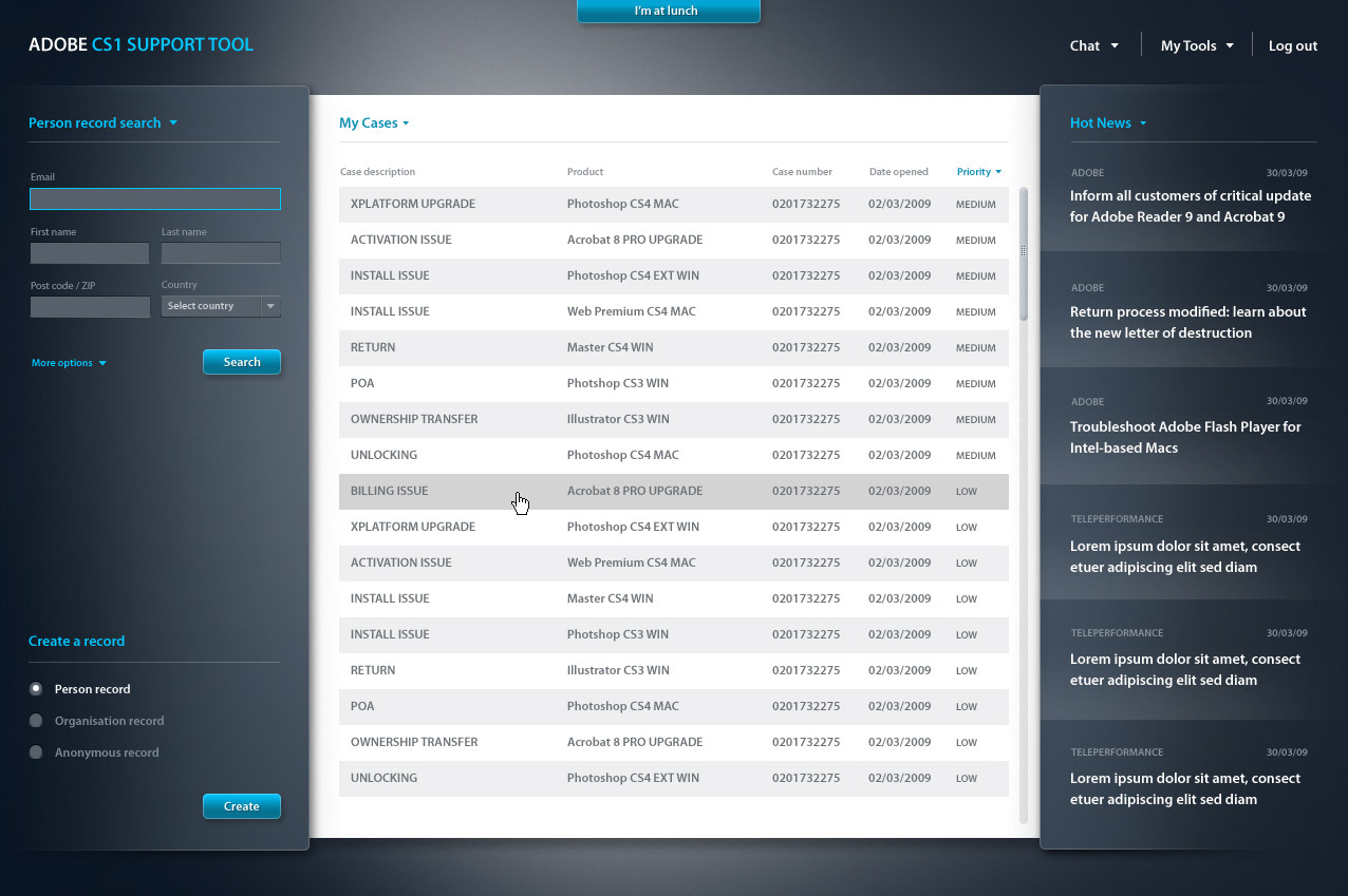
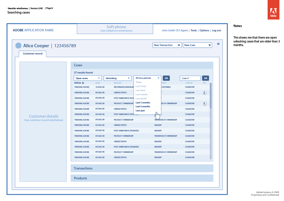
Here are a few examples on how we were able to maximize productivity through improving the interface.
Some of the final screens that I designed